SiteStacker
Free Web Design Inspection Tool
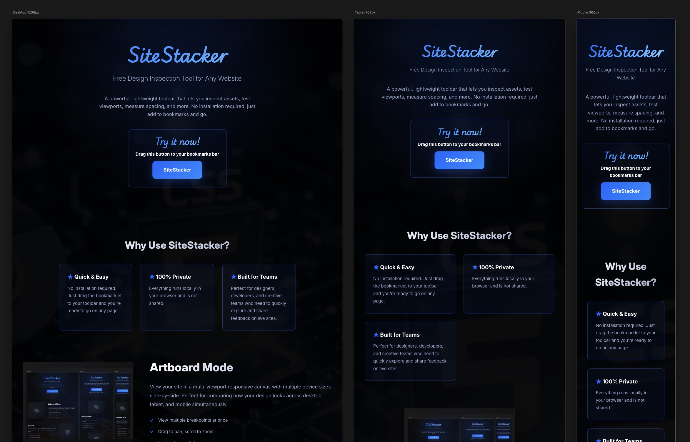
A powerful, lightweight toolbar that lets you inspect assets, test viewports, measure spacing, and more. No installation required, just add to bookmarks and go.
Why Use SiteStacker?
★ Quick & Easy
No installation required. Just drag the bookmarklet to your toolbar and you're ready to go on any page.
★ 100% Private
Everything runs locally in your browser and is not shared.
★ Built for Teams
Perfect for designers, developers, and creative teams who need to quickly explore and share feedback on live sites.
Artboard Mode
View your site in a multi-viewport responsive canvas with multiple device sizes side-by-side. Perfect for comparing how your design looks across desktop, tablet, and mobile simultaneously.
- View multiple breakpoints at once
- Drag to pan, scroll to zoom
- Interactive mode for testing
Assets
Discover all images, fonts, videos, and audio files used on the page. Includes both img tags and CSS background images, with live previews and download options.
- Detects all page assets automatically
- Preview images and play media
- Shows file sizes and dimensions
- One-click download or open
Color Scan
Extract all colors used on the page from backgrounds, text, borders, and more. Build a color palette and copy color codes instantly.
- Scans all page colors
- Generates color palette
- Copy hex/rgb values
- Finds color usage
Font Inspector
List all fonts used on the page with live samples. See font families, weights, and styles. Copy font names or test replacements instantly to prototype typography changes.
- Shows all font families and weights
- Live font preview samples
- Copy font names to clipboard
- Inspect font-face rules
Image Inspector
Deep dive into images on the page. View intrinsic dimensions, file sizes, and optimization opportunities. Identify large or unoptimized images affecting performance.
- Shows image dimensions
- File size analysis
- Quick download options
- Performance insights
Pixel Ruler
Precisely measure distances, dimensions, and spacing between any elements on the page. Hover to see live measurements and alignment guides.
- Measure element dimensions
- Check distances between elements
- Visual measurement overlays
- Pixel-perfect precision
Viewports & Devices
Simulate common device widths and viewports instantly. Switch between mobile, tablet, and desktop sizes to test responsive layouts and find breakpoint issues.
- Quick device size presets
- Custom viewport dimensions
- Tests responsive behavior
- No need to resize browser
SEO & Share Preview
Inspect all social sharing and SEO metadata on the page. View Open Graph tags, Twitter Cards, and document meta information to ensure your content looks perfect when shared.
- Scans Open Graph & Twitter Cards
- Preview social share images
- Check meta descriptions
- Validate SEO metadata